Lighten Up!

Standard

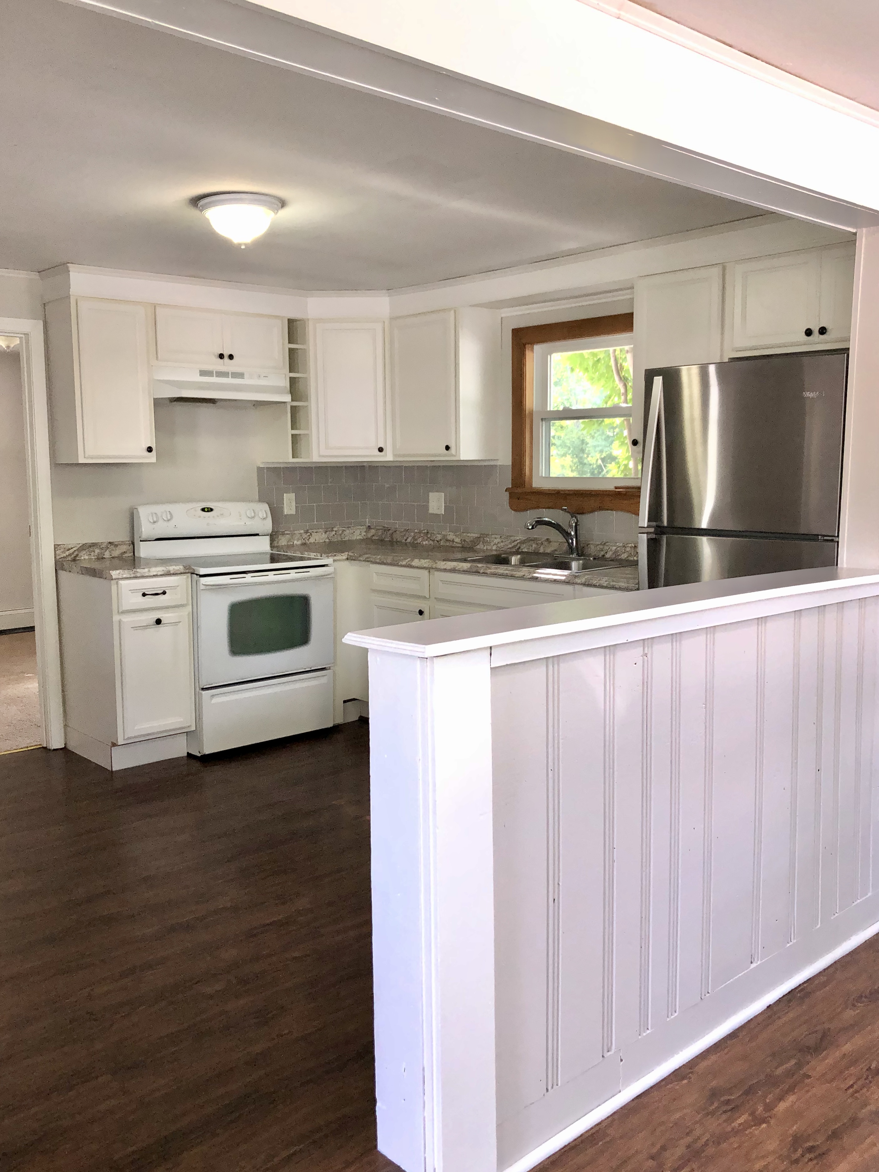
There’s always a “vision” when you look in a room.  I run through ideas of what I would like, and how I envision it in the space.  I had already transformed my kitchen from it ugly plain oak cabinets, fake countertops and green walls.  You can see that transformation from a previous post here: “Home Cooked Meal”. However, I was looking for a change- something newer/brighter.  Here is what the kitchen looked like before this project:

As you can see, it’s a small kitchen, and I felt like the decor didn’t represent my true style.  It had the antique cabinet and other elements I liked, but the color on the wall and accessory colors I chose made the kitchen feel small.  It was time to change it up!

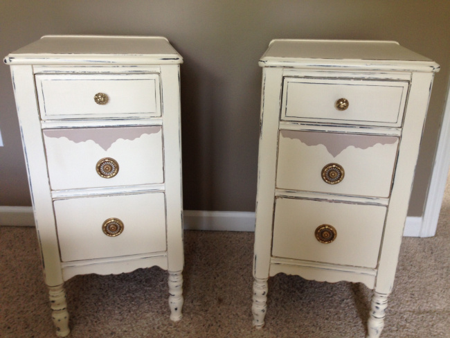
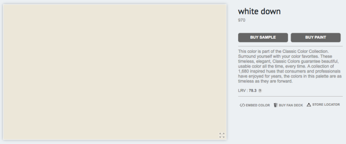
I had already painted the cabinets a light color called: “White Down” by Benjamin Moore.   It’s actually appears a lot whiter than the image below.

whitedown

It took me a while to pick out the color for the walls.  As much as I wanted to lighten the walls, I didn’t want the kitchen cabinets and the color of the walls to be too similar. So I looked at a few paint samples…

IMG_9545

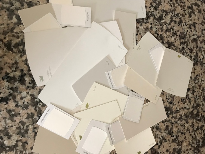
I ended up picking the color “Tapestry Beige ” by Benjamin Moore.

Once I started cutting in the paint, I was pleasantly surprised with how much brighter the space was becoming.  I didn’t realize how “dark” the previous color was.

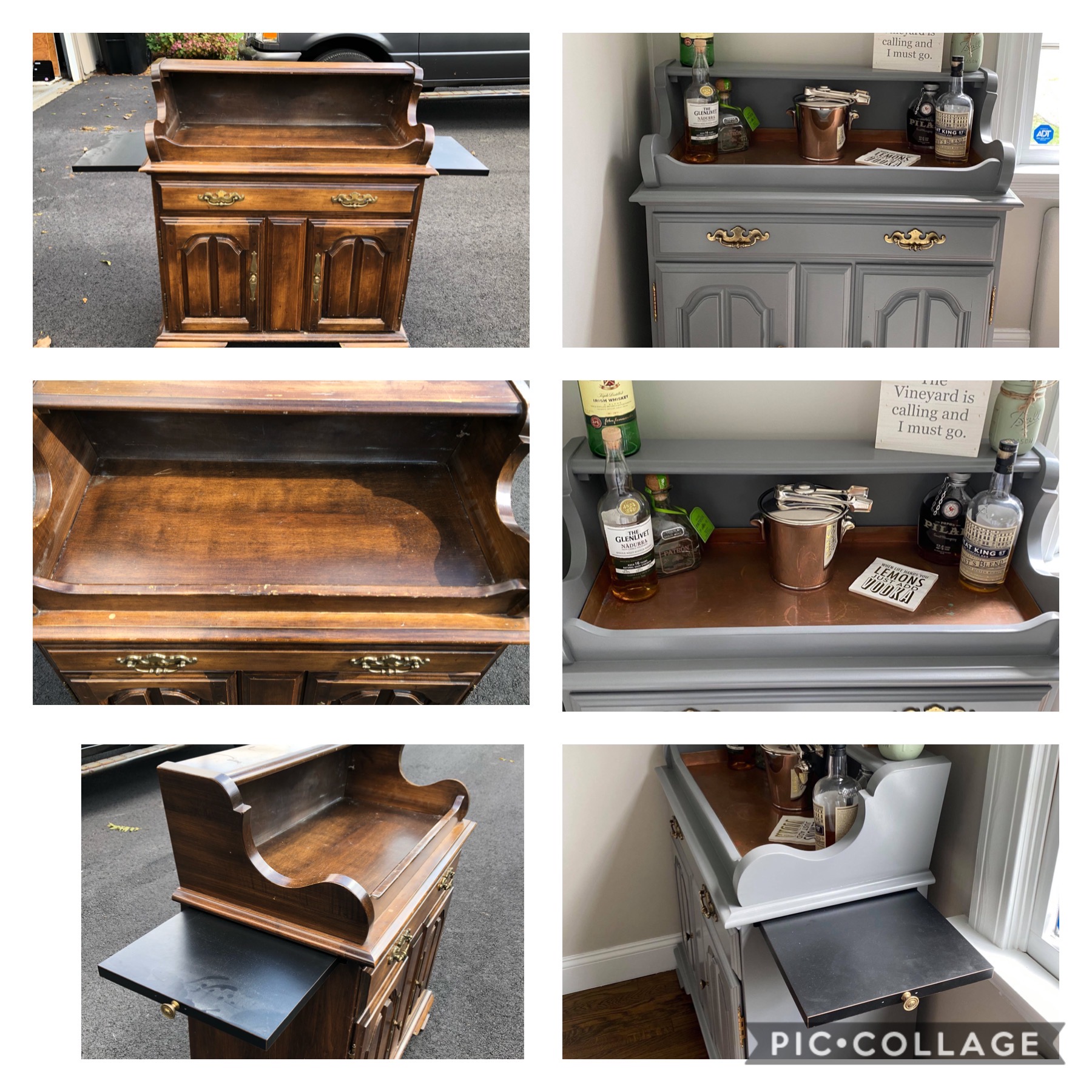
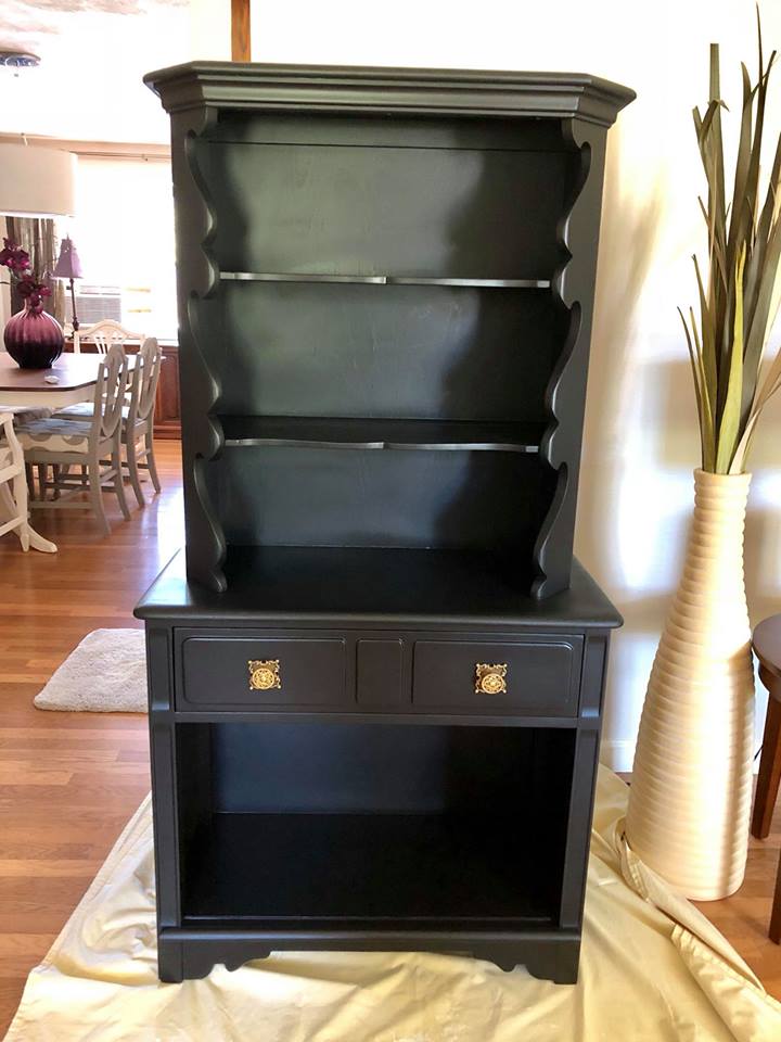
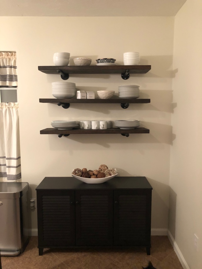
I’ve always been a fan of black and white.  It’s clean, it and classic.  I sold the antique hutch, and replaced it with a low black cabinet and rustic shelves.  I love seeing all the white dishes on display, and storage underneath is a bonus!

2

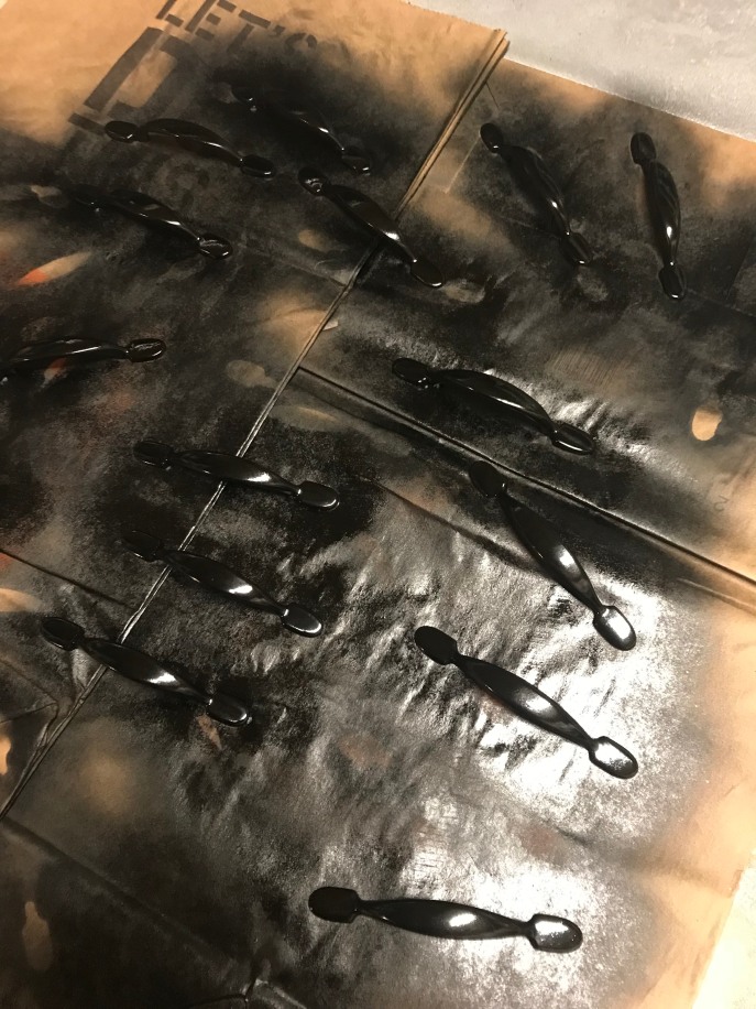
I took the old hardware, that I had previously sprayed bronze, sanded them and re-sprayed them in black.  This was an easy fix, and extremely cost effective since I didn’t need to buy new hardware.

kk

Final details like curtains and accessories I kept to white/cream or white/cream/black combo.  I replaced my cream and orange canisters with whit ones, a simple white utensil holder, and my favorite- a creamy white colored kettle.  I keep very little on the counters so it doesn’t look cluttered.  Again, my goal was to keep it clean and classic.

All in all, I am very happy with the turn out.  Here are after pictures.  Unfortunately in order for you to see curtains I had to take some pictures at night and some during the day.  I’m not too thrilled with the pictures, but here they are:

Seven Days In The Seventh Layer of Hell

Standard

Well, I did it. I finished the job! I have to say, painting the rooms bathroom and kitchen was easy…. it was the damn paneling that was a nightmare! Also, the trim was so yellowed/not painted at all, that painting it all white made the most incredible improvement. It took me 7 days, working 6 hours each day. I popped Advil and iced my shoulder each day until it was done, and done well. I have high standards, which is why it probably took me so damn long in the first place.

Here are some before shots:

Ok, I am all set up, ready to go, but where the hell do I begin? I started with cutting in along all the baseboard, windows and ceiling. I also covered SOME (yes there were more!) markings that were on the walls with paint as I went to ensure extra paint coverage.

The first coat of paint had to be put on heavily, the walls were so dry it sucked it right up! However, after two heavy coats of paint, the walls were brand new. With the walls in the bedrooms, bathroom, and kitchen painted, I was ready for my stand off with the paneling. Boy, it was quite the shoot out. You see, the thing about paneling is… that in order for the paint to adhere to the paneling, the walls and seams need to be prepped with primer. When the paneling has more ornate seams than that of standard paneling you know you’re going to be doing this for a long time.

So with my trusty Purdy brush, I used KILZ primer, and brushed each and every seam, and cut in all around base board, windows, doors and ceiling.

My shoulder was shot once I was done. But..WOW, when I looked around I noticed how much brighter it already looked! I knew I had made the right decision, which made the tediousness feel worth it. I rolled the primer on the rest of the walls. From there, I had to repeat the whole process of cutting in and brushing all the seams with paint (x2 coats).

The next and final step would be quite the feat as well. ALL the trim (baseboard, door frames, window casings) needed to be painted as well. This is a very time consuming process.

At last, 7 days later, I was done. I have to say, this project was a much bigger undertaking than I thought and I am very proud of myself for completing it. Here are some quick before and afters. More after photos will be at the bottom! Enjoy!

The Desk At The Beach House

Standard

The desk wasn’t in terrible shape, it just needed a make over.  It was actually easy to sand and prep for paint, which isn’t always the way it works out; some pieces can be a real pain in the a$$.  Once I had it all sanded and cleaned up, I wasn’t sure what I wanted to do with it.  In fact, it has been sitting up in the guest room naked and afraid for months, haha.  You know, when I work on pieces I tend to spend some time determining what I want the piece, in this case the desk, to express.

So I got to thinking… the desk wasn’t worn or in rough shape, and it made me realize it probably wasn’t used much.  Isn’t the purpose of a desk to be a comfortable place to foster work or inspire ideas?  Well it saddened me to think this desk’s purpose wasn’t fulfilled.  I know that sounds crazy, but it’s true.  Each piece of furniture has a story, beginning, middle, or end.  This desk is old but only at the beginning of its story- cheated out of love and affection.


My gift to the desk was to provide it a seemingly fulfilled life with a makeover.  I decided the piece would look overly worn, by also showcase elegance.  Great contrast in design ideas, but lets imagine it’s story:

I picture the desk sitting in an upstairs room of an old beach house.  It was painted blue to compliment the white worn walls, sandy beach, and blue skies.  The top was finished with a deep stain to look solid, sleek, and elegant.

IMG_9609

The atmosphere in the room felt like the beach sand and sticky air was actually inside.  Remembering the piece is old, I pictured a pile of papers with handwriting, postal mail, and an old time clock on the desk.  It looked hectic, but still felt organized.  Lengthy amounts of time were spend at that desk.  Perhaps an author used the desk to write a novel, and was inspired by the beach; like Earnest Hemingway’s “Old Man and The Sea.”  Over the years, the sticky air inside the room of the old beach house brushed paint off the desk, showing the dark wood beneath the color blue.  It felt like the incoming of the crashing waves caused the paint to appear distressed.  However, the top remained dark , in tact, and elegant.  How could this be?  Taking a closer look, you would notice that the top of the desk was protected by stacks of papers and mail.  The stack of papers was not comprised of bills. receipts, or unnecessary mail; instead they held much greater value.  The papers were pages written by some one that was inspired to write a book; demonstrating hard work, dedication, and re-writes to create perfection.  The mail on the desk consisted of saved love letters; each one tucked into it’s envelope in order to keep it safe.  One day the family passed the old beach house down to the next generation, but the desk remained.  Having served its purposed, and relishing in its fulfilled life.


The end.

Backyard Overhaul!

Standard

When I first purchased my home I was so excited to have found a place with a fenced in yard for my dogs.  It was all mine, but it was an absolute eyesore.  Well, here I am, 5 years later, and it has finally come to fruition.  Yes, a long time, whatever!  Each year I focused on a little something.

Problem #1: Back landing/stairs:

I started with the back stairs: or lack thereof.  These stairs were comprised of cinder blocks with bricks laying inside.  There was nothing holding it together but prayers.  I knew this was the first thing to be resolved- how the hell would the dogs, or myself, get in and out with out feeling like we were walking the plank?  Here are the before pictures:

As soon as my father and I started pulling away the bricks we saw that the whole inside was pretty much hollow, and the cinder provided no structural support.


A friend of mine from high school does masonry work on the side, and he installed the most beautiful blue stone stairs. The landing was wider, safer, and well- better looking:


Problem #2: White Stones

The back yard was filled with white stones; apparently the previous owners had an above ground pool and used these stones around it for drainage.  It was labor intensive to remove them.  Actually it was a b*tch.  My father and I sifted for days just to try to get some of them out.  These stones, although mostly gone, would continue to pinch my feet as I walked around.


Problem #3: Fence

As you can tell from the previous photos, the fence was barely standing up straight.  A new fence went up with an awesome new gate (that worked).


Problem #4: Patio

The brick patio wasn’t very attractive and definitely needed an upgrade.  It didn’t expand out towards the bulkhead, which left this open space.  I was left scratching my head.. umm, what the heck do I do with this?

Again, my friend from high school helped me pick out the cobble stone, and he crated the most beautiful patio for the space, and even incorporated some of the brick for an extra touch of flair.  The patio extended all the way to the bulk head, which provided a perfect space for the grill.  He re-used the brick to fill in the pathway to the gate.  By using the brick I already had, it was cost effective and really cleaned up the narrow space between the house and fence.

Problem # 5: Grass

Ok, so all these things look great together, but the greatest eyesore of the whole backyard was the lawn.  Excuse me I stand corrected: there was no grass, just desert scrub that existed in patches. Now this was difficult, because I have two big dogs, and I knew my choices for laying down new landscaping were limited.

Option #1) Seed: It would be almost impossible to put seed down- the dogs would walk through it and destroy the seeding and bring mud in the house.  Thus making more of a mess with little results.

Option #2: Hydro-seed: well apparently I didn’t have enough square footage for “it to be worth it,” as I was told from a few companies.  I say “to hell with them!”

Option #3: Sod.  I was terrified to put sod down, I know it can be temperamental and difficult to maintain in its early stages.  I figured I could replace pieces here and there if need be, but it made the most sense: I would get grass immediately and the dogs wouldn’t be able to inhibit its growth or bring in a hot mess!  I hired Dorabella’s Landscaping, and they were wonderful!  They took what was left of those damn white stones, grated it all, put fresh loam down, and perfect laid out the sod.

As you can tell the dogs are quite happy.  The whole dogs peeing on the lawn and causing yellow spots is another problem, but it will all work out.

I purchased new cushions to go with the really beautiful patio set I already had.  All in all, it was a lot of work, but now the backyard is done, and it’s a space I enjoy spending time in.

What a difference savings can make!

Standard

Ever find home decor you LOVE, but then see the price tag and run far far away? Well sometimes you can have it all- the decor you want at a cheaper price.

I was at Jordan’s Furniture with my mother the other day (she was mattress shopping- a detail you didn’t know, but there it is anyway). I wandered around, looking for inspiration. I came across these gorgeous prints with blue designs. I zoomed in to look at the price tag and my eyes bulged out of my head- very cartoon like. Are they beautiful? Yes. Are they worth the money? Debatable. Here they are below:

Gorgeous right? Well I moved on rather quickly, but then I got to thinking….. I’m an avid Target shopper- you know that store where you go in for ONE thing and you leave $200 later not knowing what happened? Yeah that store. Anyway… I remember strolling through the aisles and coming across something similar.

For the purpose of my research, I went over there after my Jordan’s Furniture trip. Low and behold I found what I was looking for. Granted these are not the same size and a little different in style, but man they are pretty damn close!

Here is what I love about the ones at target. First of all- it’s a set of TWO! Second- the set comes in at:

So let’s to the math….

Jordan’s Furniture VS. Target:

That’s a savings of: $499.95!!!!

Say whattt? That’s a score! So my message to you: if you see something you like but it’s over your budget, don’t feel defeated, just keep hunting!

Thanks for reading! Remember to like Renewed Reloved on Facebook!

Black ALWAYS Looks Good

Standard

A while back, my father and I picked up this hutch at a yard sale.  It was green (or some sort of “green”), with ridiculously ornate doors and hardware, but beneath the ugly I saw some beauty.  It’s a rare sized hutch, perfect for small spaces, which is often hard to find. Unfortunately, I can’t find the pictures of it untouched with the doors on and everything. What I have below is the piece after sanding, and a considerable amount of patching.

Once it was all set for paint, I opted for a light cream color.  While I was painting out front, a neighbor drove by and said she had been “eyeing it” in the garage, and was waiting for me to start it!  I love when things like this happen; people see a piece I am working on, and have the same mutual respect for it.  Right then and there we made a sale, but she asked me to paint it black.

Now, at first I didn’t think that black was a good choice because it can be a rather unforgiving color, and harsh, but when we she showed me the space she was putting it in I knew it could work quite well.  Black would work well for a number of reasons 1)it would match well with what else she already had in the space, 2)it complemented the other colors in the space, and 3) the color made the piece stand out, but small enough to not be an eyesore.

I decided to keep the original hardware.  Although ornate, it brought out some beautiful detail that was lacking with solid black.  Check out the finished product!  Please note the shadows and lighting affected the image quality.

What can I say?  Black always looks good!

37584470_1978393142191726_2703698216527855616_n

CIVIL WAR

Standard

This particular custom order came to me… a bit… well… looking for a serious make-over.  A gorgeous piece- just “struggling” a bit.  There was plenty to work with: a tall back that supported a swinging mirror, a unique shape, and original black porcelain handles, which were in good shape! The painted design on the drawer fronts were probably beautiful at one point, but most of it had chipped away.

I started sanding off the painted design on the front of the drawers, but I could see how dry the piece was.  I decided to sand the whole piece down to the original wood, to breathe some fresh life into it.  It’s funny you know, having a conversation with a piece of furniture like: “Stop that fussing, you’ll look better in the end,” but I didn’t receive too much back talk.  When the piece wall sanded, it looked alive again.

Pretty good right?  Yes, yes indeed.  However, I knew that the wood was so dry that it was going to completely soak up the paint.  I used KILZ primer to give a solid first coat, which also covered up any stains.

If you follow my blog, you will notice that I try to name the pieces because it’s just more fun that way.  I titled this entry “Civil War” for a couple of reasons:

  1. It was a battle for beauty
  2. My client provided me with the paint color.  Benjamin Moore’s “Confederate Red.” (Although Benjamin Moore has recently changed the name to “Patriot Red”)

paint

The color is so rich and vibrant, it was a perfect fit for this piece.  Anyway,  with a few coats of paint and sealant, a bit of re-assembling, and freshly polished hardware, this piece turned into a beauty!

I think it is important to note, that not all pieces need to be “distressed,” and sometimes I feel like distressing is the go-to nowadays.  Personally, I think you need to get to know the piece you are working with.  I felt that because this piece already had such a unique shape, ornate mirror, and black porcelain handles, it didn’t need distressing.  I felt it would be too “busy.”  You may disagree, but I’m sticking to it.  Here is the finished project:

37402470_1975285585835815_5682131416373002240_n37275244_1975285729169134_1535010582762094592_n37340892_1975285662502474_7919303722499309568_n37369306_1975286152502425_2719971791777824768_n37394259_1975285655835808_3041704871343423488_n


“A CARD IN A BOX”

Standard

Since I love being so crafty- I created a lot of the decorations used at our wedding.  One of my favorites was making our card box.  I wanted it to fit in with that antique feeling I was going for, but was looking for just the right piece.  One day, my husband and I headed up to a vintage store, and there we found an antique dining flatware box.  It had seen better days for sure.  I always try to envision what the story is behind each item.  When I came across this box my mind ran wild with ideas.  Perhaps it had been in a husband and wife’s home for years, and it is where they stored their fine china flatware, and maybe they received the box at their bridal shower or wedding.  How fitting since we were getting married.  Immediately it was a must have- “This is it” moment.  Here is how we found it:

I started by ripping out the inside of the box:

I sanded the box and painted it with Annie Sloan’s chalk paint.  Once it was dried I distressed it and used antique wax to add some depth and seal it.  I used fabric I already had, and then used the thick card stock from a gift bag I had lying around in the closed.  It provided the perfect lining for the drawer.

Now- to accessorize….. For our wedding I wanted to put this on display and stage it.  Here’s how I staged it:


By: Renewed Reloved

The Perfect Pair

Standard

When I was moving into my new home, I needed a new bedroom set.  I didn’t want to spend a lot of money, so I figured I would use my sorcery to bring old pieces back to life.  I don’t usually do pieces for my own home, but I was excited to start…

I had done work for a client, and she had a dresser she was looking to pass on.  I absolutely took it with me!  The problem was…I needed end tables to go with it.  Some were too short, to wide, or just ugly.  I’m not goldilocks, but I wanted them to be perfect nonetheless.  One day, on the hunt, I found two (in rough shape) matching end tables. What made it even better was the engraving that had a design similar to the dresser!  I didn’t care how ugly they were, I had to have them!

Here is the set BEFORE it had been renewed and reloved:

OLYMPUS DIGITAL CAMERA

You’re probably wondering- “uuummmm I am sure she could have found something better than THAT!…”  Well just you wait and see friends!  It started with sanding, it took quite some time to get the finish off, especially the end tables.  You can see how glossy the end tables were from the picture above.  Sanded and washed, I decided to engrave the wood a little more around the design that was barely peeking through.  I chose two colors- one for the base, and the other for the decorative design.  I was very satisfied with the result:

OLYMPUS DIGITAL CAMERAimage-4

The dresser’s knobs were all there, but different, which is usually a problem (when you want to keep it authentic).  The bottom ones needed to be adjusted, so there were different knobs on it, but luckily the original pieces were in the drawer!  Really simple fixes- they look like door knockers and the knocker piece fell out of the holder.  Pliers and some strength fixed that real easy! Here was the final outcome! I love it, and I love how I got two separate pieces to match and become the perfect pair!


By: Renewed Reloved